2018-2019
YEAR
TEAM
Product Owner
UX Designer
UI Designer
Development Agency
Business
Hubscape Dashboard Management
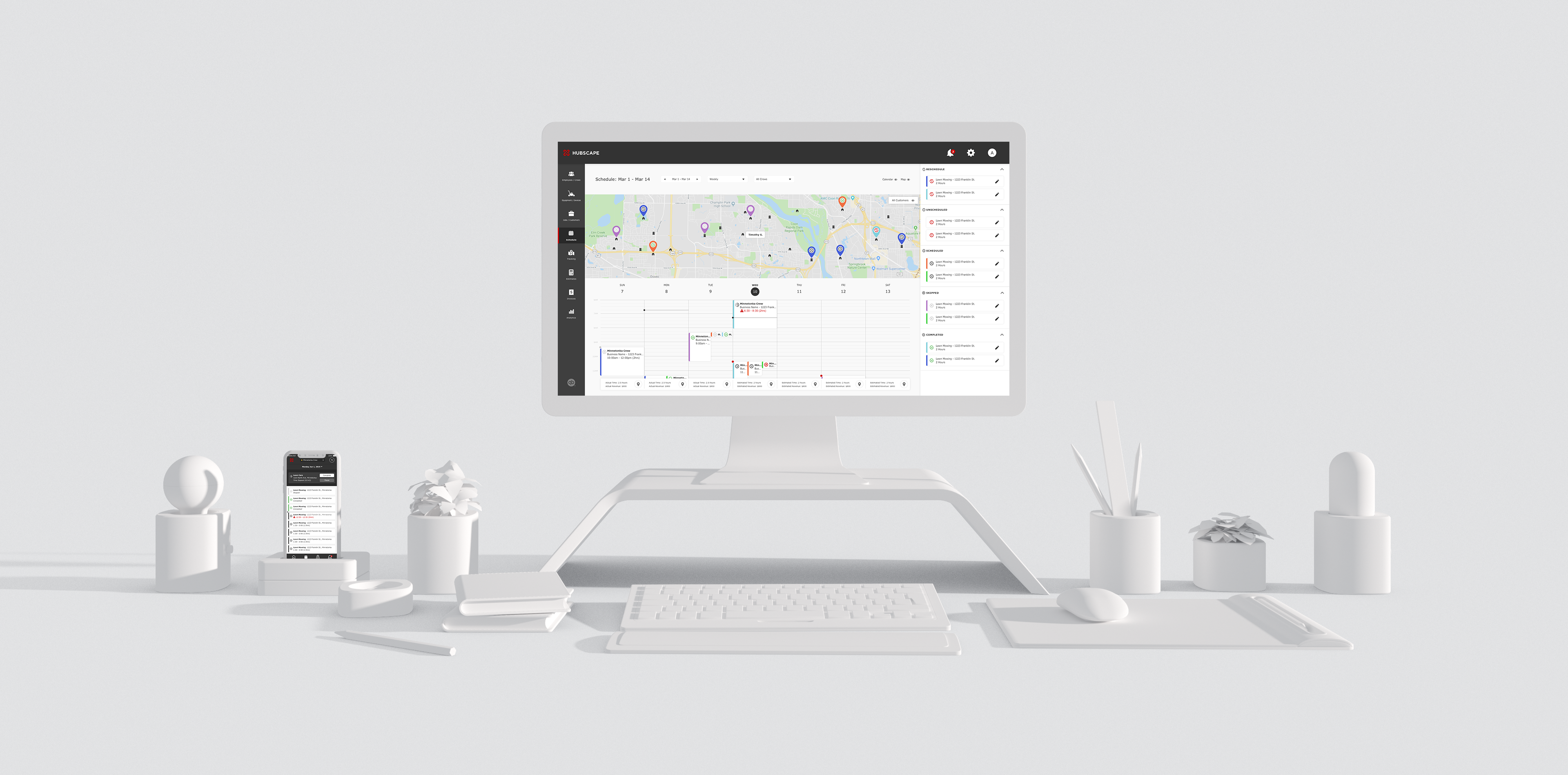
My client is a leading provider of innovative products and services for commercial and contracting businesses within the outdoor industry. The idea for Hubscape was introduced as a means to provide a centralized platform that allows businesses to fulfill operations such as team management, scheduling, and client management--all in one place. From a business perspective, the platform tells you how efficient you are in each cost category as well as projections to boost your profitability.
As the UX designer, I facilitated Hubscape's MVP in discovery and design and eventually transitioned into a supporting role for design updates. The following case study will walk through the decisions made for design with a focus on enterprise products.
DISCOVERY
In the kick-off, my client gave us a brief, proposed a robust list of requirements for the proposed product, and documentation for user research. Using this as my starting point, my initial thought would be too convert the information into a few visual deliverables that could be used to align with the rest of the team. Below are a few examples of how I achieved this.,
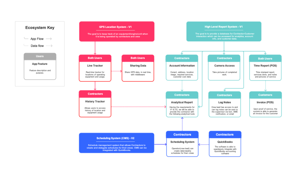
ECOSYSTEM MAP
The goal of this particular deliverable was meant to shows high-level exchanges between the product's components, data points, and corresponding users. With the list of functional requirements, I was able to define significant categories such as Reporting, Scheduling, and Tracking. After that, it was much easier to delegate user tasks into each bucket. With an organized list, it was time to connect the task flows. This allows us to define interactions not accounted for as well as more questions to gather from the client.
USER JOURNEY MAP
Using the ecosystem map and user stories as a reference, I drilled down into each category by creating a user journey map. At a high-level, the journey map captures the user's key workflow in sequential order. Drilling down into each individual task, you'll find that I was able to also identify specific user requirements and activity. Again, these deliverables helped create a shared mental model between designers, developers, and stakeholders on the project. For example, our developers used this map for estimating, road mapping, and determining technological constraints.
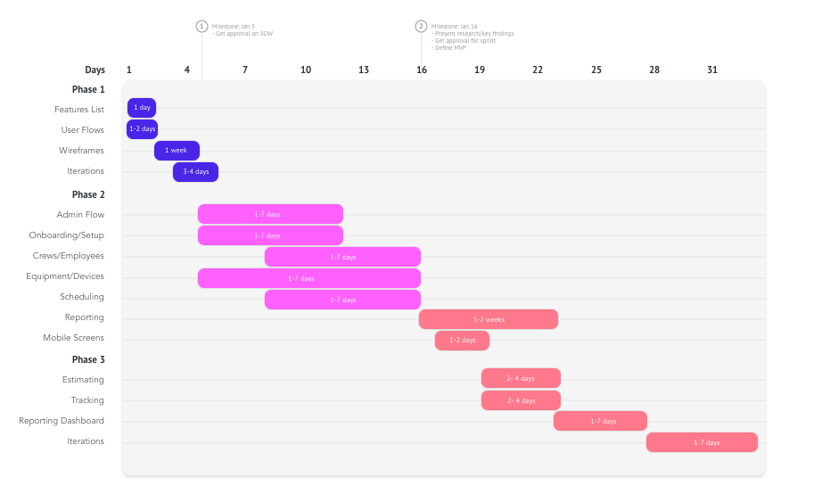
FEATURE PRIORITIZATION
With a clear understanding of the product and our users, one of my final steps includes prioritizing the list of requirements and proposed features. Addressing the findings from users, business goals, and development capabilities, I organized the features list by high-low priority and road mapped them into 3 design phases.
DESIGN SPRINT 1
My design process for this particular project was a series of iterations powered by feedback from both end-users and stakeholders. Being a robust system, my goal during the process started by defining a design system that includes components, branding, and user interaction. With those elements established, I was able to focus my attention to hi-fidelity wireframes so that they were readily available for testing.
USER FLOWS
User flows helped define the path taken by our users on the application in relation to our user journey. I designed user flows for each user and their journey, defining entry points through a set of states towards a successful outcome and final action--such as creating a crew. Below are a few examples from each user. There were a total of 18 major flows between the 3 users and the system.

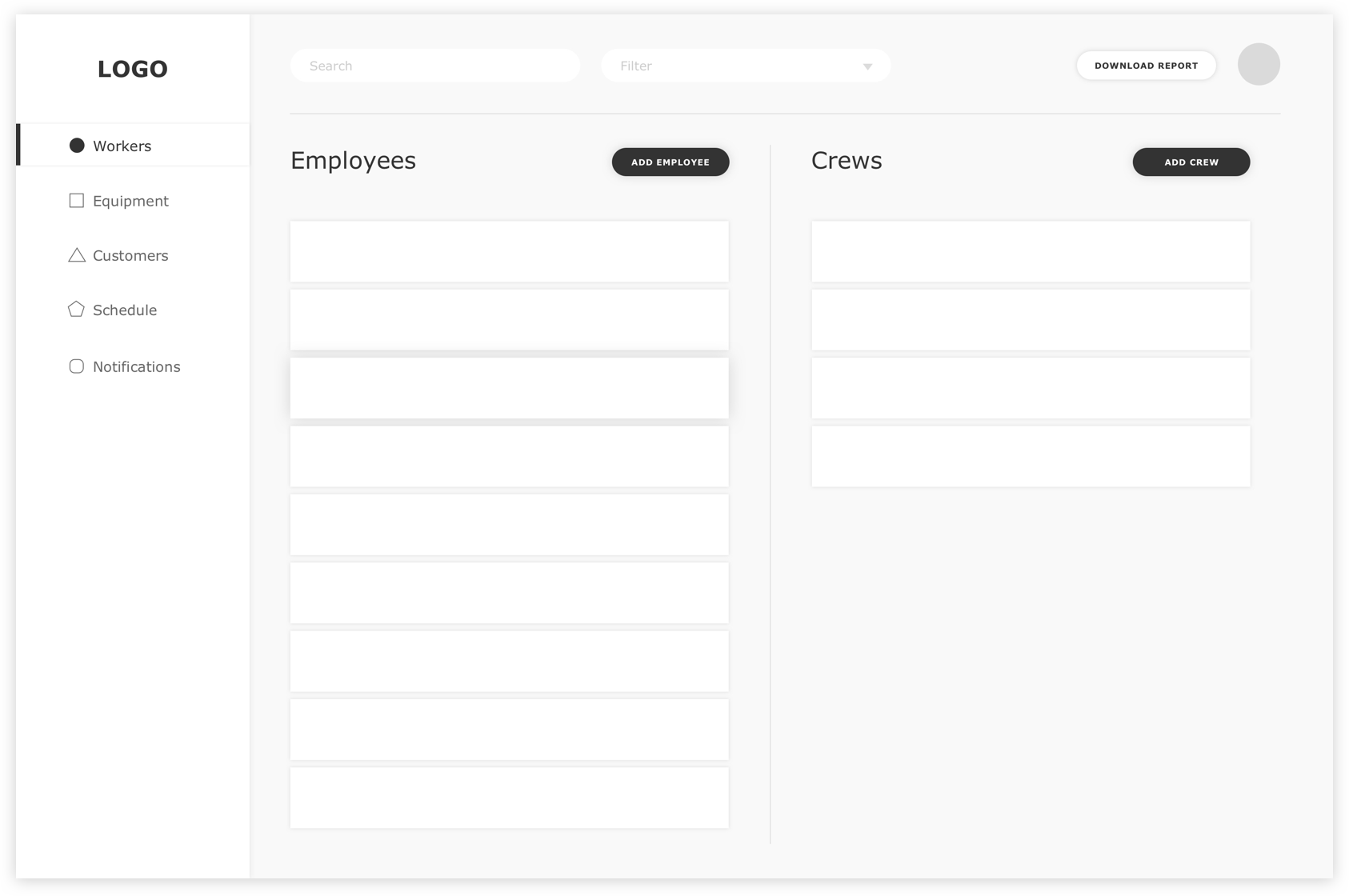
WIREFRAMES
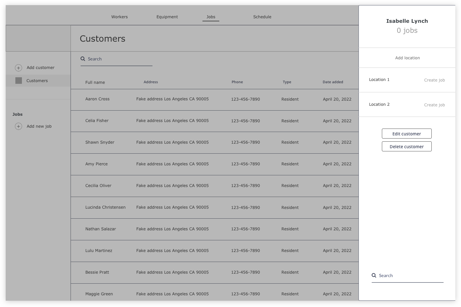
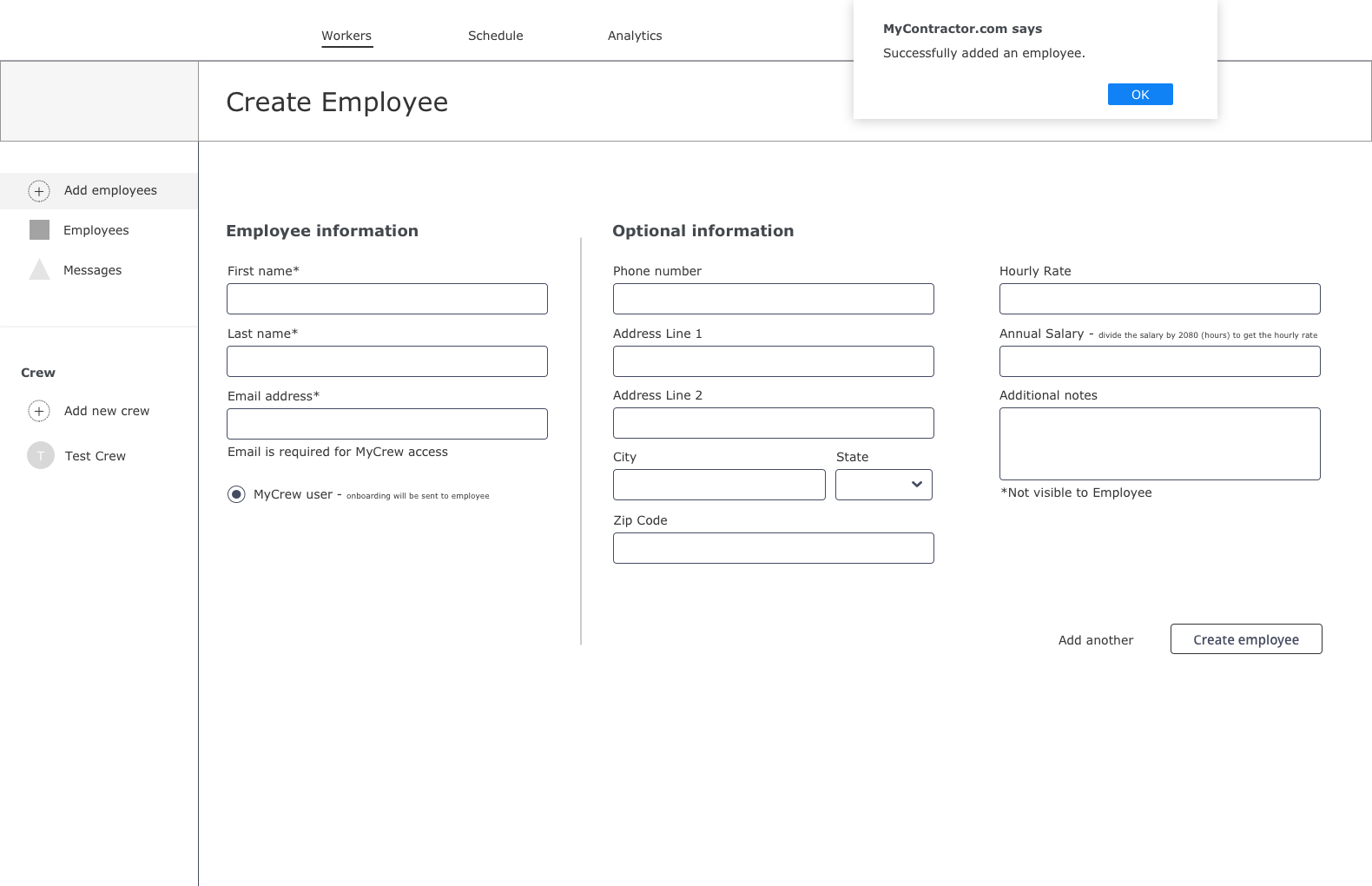
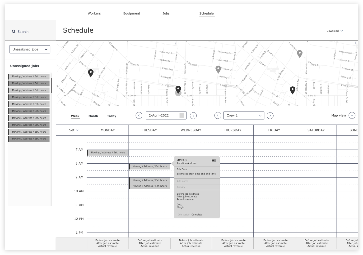
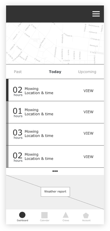
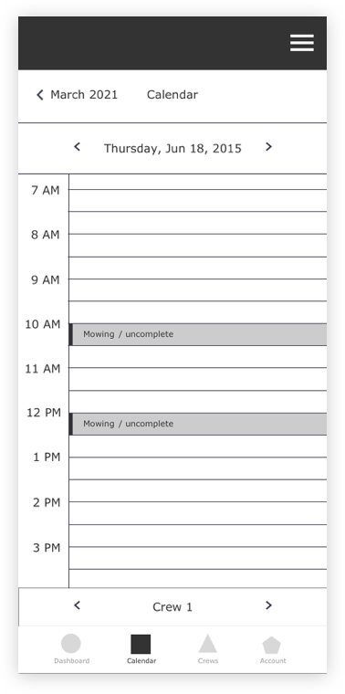
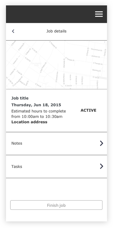
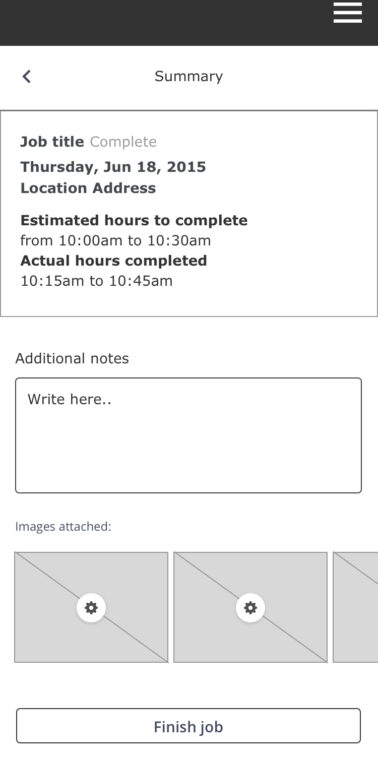
Lo-fi wireframes were built to determine the informational hierarchy of each page and screen so that it is easier to play the arrangement of content, system requirements, and user experience. They're simple and focused entirely on the basic structure of the key states of the platform. Each screen is cross-referenced with the coordinated user story to ensure that I am meeting all the needs of the app. Below are a few examples showing how I was able to achieve approval for some of the major interactions throughout the app.
DESIGN SPRINT 2
With approved wireframes, my next task was to incorporate the design system into high fidelity designs to capture a more realistic model for user testing. The secound round of wireframes helped uncover details which were not defined in sprint 1 such as microinteractions, content reorganization, and new components.
PAIRING GPS DEVICE WITH EQUIPMENT
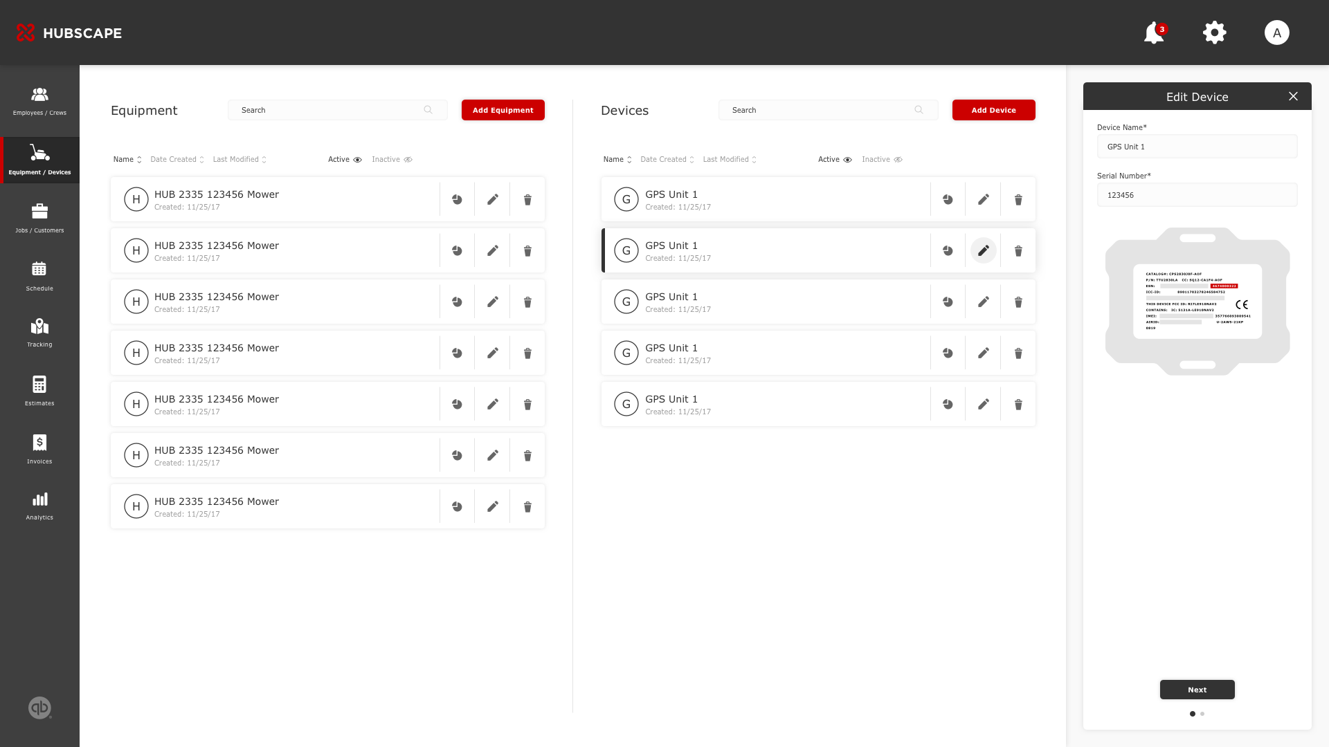
Pairing an external GPS device with lawnmowers, leaf blowers, tractors, etc is essential to the tracking component of this app. This action requires two different elements (device and equipment) but would need to fulfill the same outcome. The challenge was designing a workflow that meets these requirements but also is adaptable to other important states such as crew, schedule, and customer management. My goal was to reduce confusion by making the workflows consistent.
1. SPLIT COLUMNS
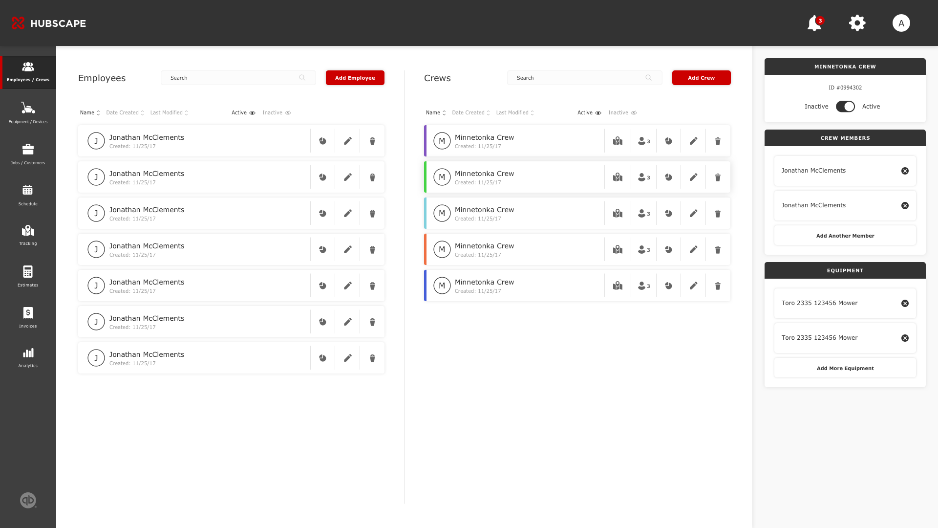
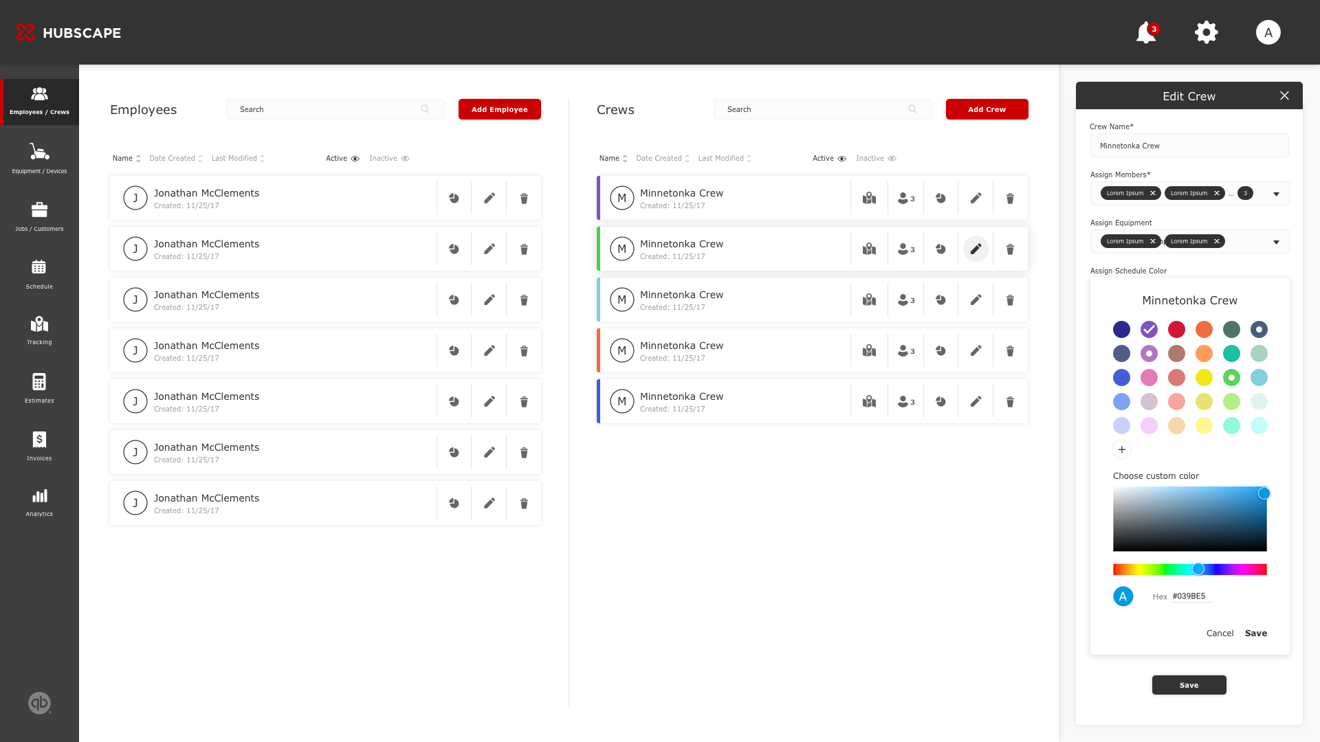
The two-column layout allows users to see an overview of both customers and available jobs before they drill into an activity such as assigning, updating, and editing. To create a clearer indication that each column is an independent, such as the equipment and device, I decided to include headers, sort functions, and search functions for each column.
2. SIDE SHEET
One of my goals was allowing users to drill into secondary content while remaining visual with the primary content. In this example, the list of actions in the side sheet affects the screen's primary content, such as editing information for a selected device.
MORE SCREENS WITH SIMILAR FUNCTIONALITY
EMPLOYEE & CREW MANAGEMENT
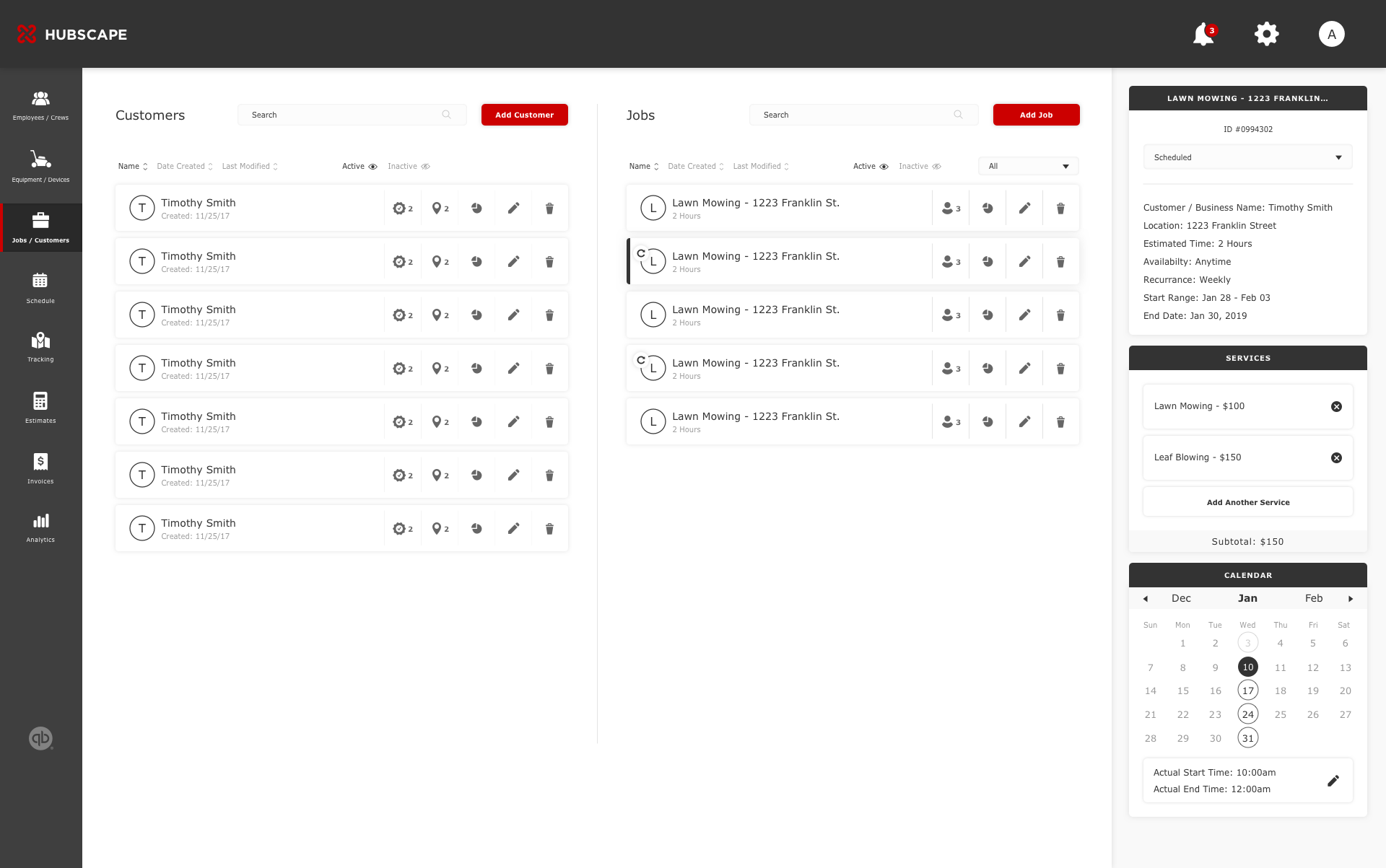
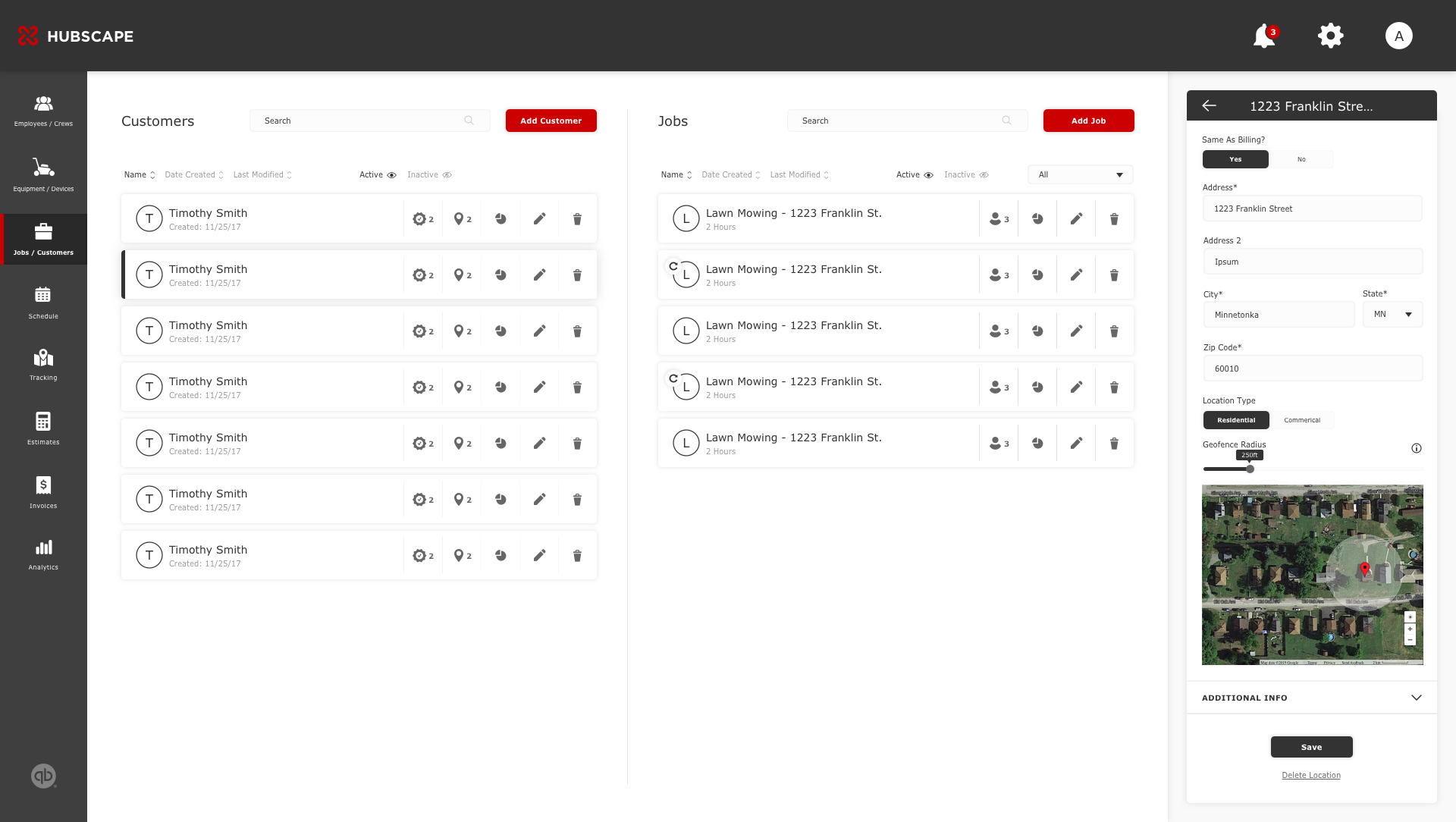
CUSTOMER & JOB MANAGEMENT
SCHEDULE MANAGEMENT
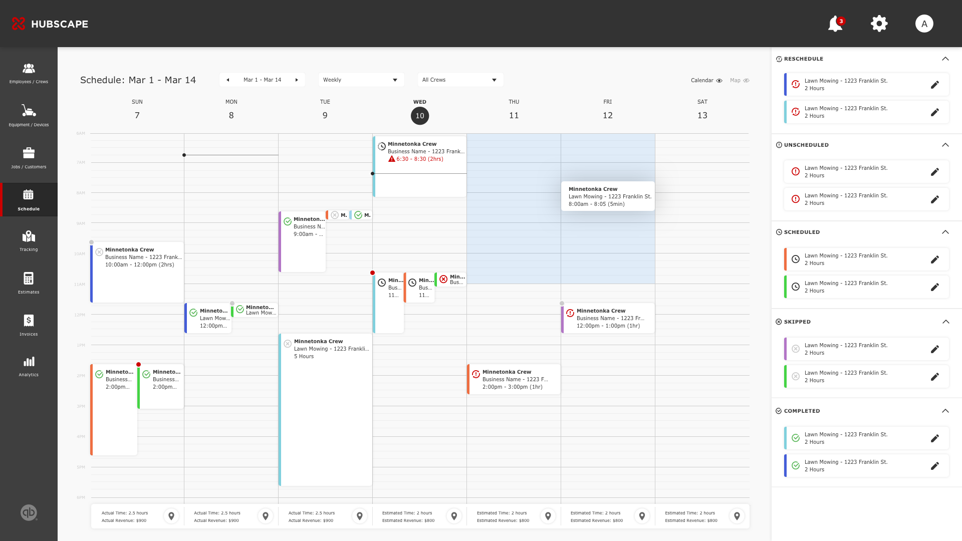
The schedule management portion of this platform introduces a robust system of unique workflows. Overall, it is important that an operator is able to schedule, update, manage, and monitor jobs all while being able to communicate with crew members in real-time. I approached this feature by looking at the bigger picture and then breaking it down into user flows. This allowed me to define the relationships between each interaction and how they contribute to the end goal.
1. DRAG & DROP
Due to the nature of the business, operators are constantly assigning/reassigning/updating/canceling jobs. The drag and drop function makes this easier and faster without leaving the calendar. The job cards in the sidesheet are categorized by their respective status's (reschedule, unscheduled, scheduled, skipped, and completed) along with their colors. To schedule them into the calendar, which could be sorted by date and crew, the user simply drags a job item into an empty slot. To avoid overlap with crew availability, the system will automatically indicate available slots with blue; red for unavailable.
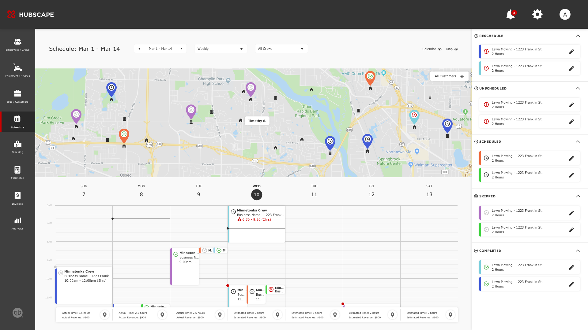
2. MAP VIEW
The user has the option to view scheduled jobs in a dropdown map. This allows users to strategize schedules for crews while considering the time available and the distance in location. For example, scheduling one crew (crew A) for jobs 1 and 3 is relative in the distance and maybe more efficient than scheduling two different crews for those jobs.
MOBILE: CREW MANAGEMENT
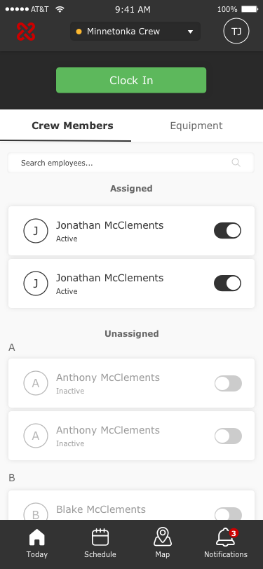
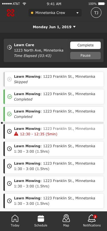
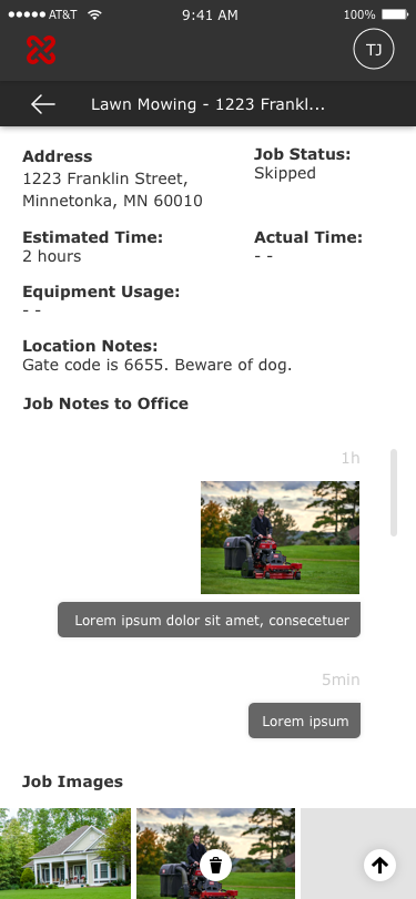
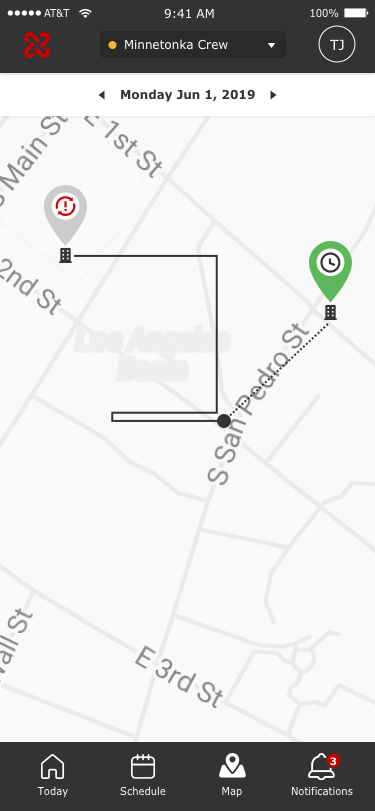
Expanding the app to mobile serves two major purposes: crew accessibility too jobs and tracking crew productivity. With that said, crew leads, and members will have access to a calendar view, job dashboard, job details, and an active job state. Because crew members are constantly dealing with multiple jobs a day, I suggested that the system to automatically notify when jobs begin. From a business standpoint, the app will also automatically start tracking during the start of jobs. We found this makes it easier for office to track and predict labor costs as the project is happening.
DESIGN SPRINT 3
Sprint 3 brings in features for phase 2. This includes integrating Quickbooks, estimating tools, geo-location tracking, and anayltics. Some of the challenges were interpreting complex input data into functional designs. Below are a few concepts which will be used for user testing.
SERVICE ESTIMATING TOOL
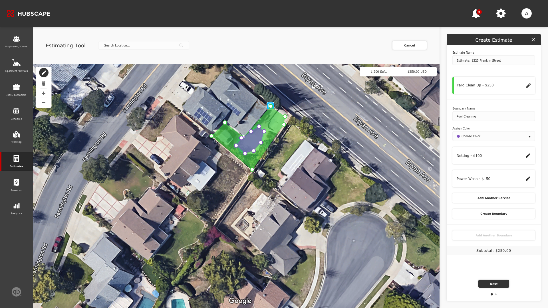
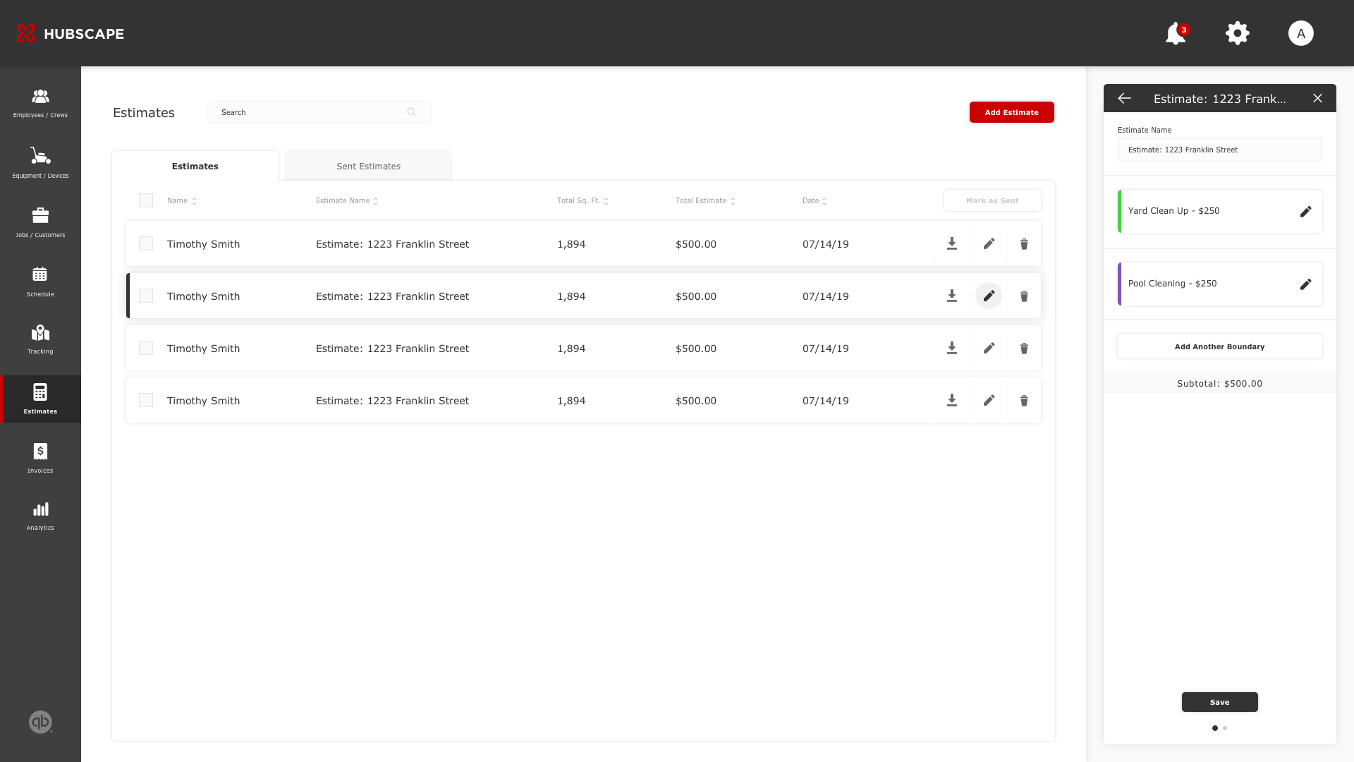
We found that a majority of users were using third-party applications such as Autopilot to create estimated proposals for their customers. Addressing the strengths and weaknesses from competitors, I designed this tool to fit out the user's needs. From a business standpoint, this allows sales to ease into a relationship with their clients. From a crew standpoint, leads are able to plan accordingly before each job.
GEO-LOCATION
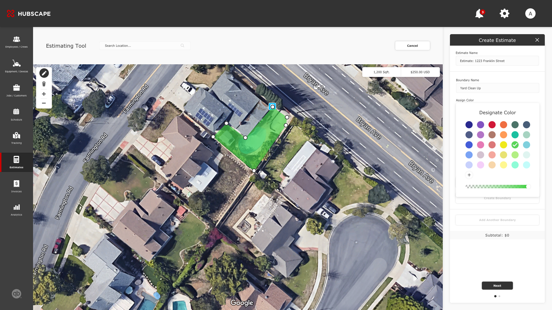
This feature allows users to search for a customer's address with Google's map integration. Using pinpoints, users can draw and complete coordinates for a specific location. After that, tasks are assigned to each location. The system will automatically generate the total estimate based on pricing attached to each task.
CUSTOMIZATION
It is common for an estimate to contain multiple job-specific areas such as pools, backyards, and front yard. Including features such as a color palette and opacity scale, it is easier to indicate overlap and indicate these areas; thus, reducing estimated errors.
MORE ESTIMATING SCREENS
TRACKING PRODUCTIVITY
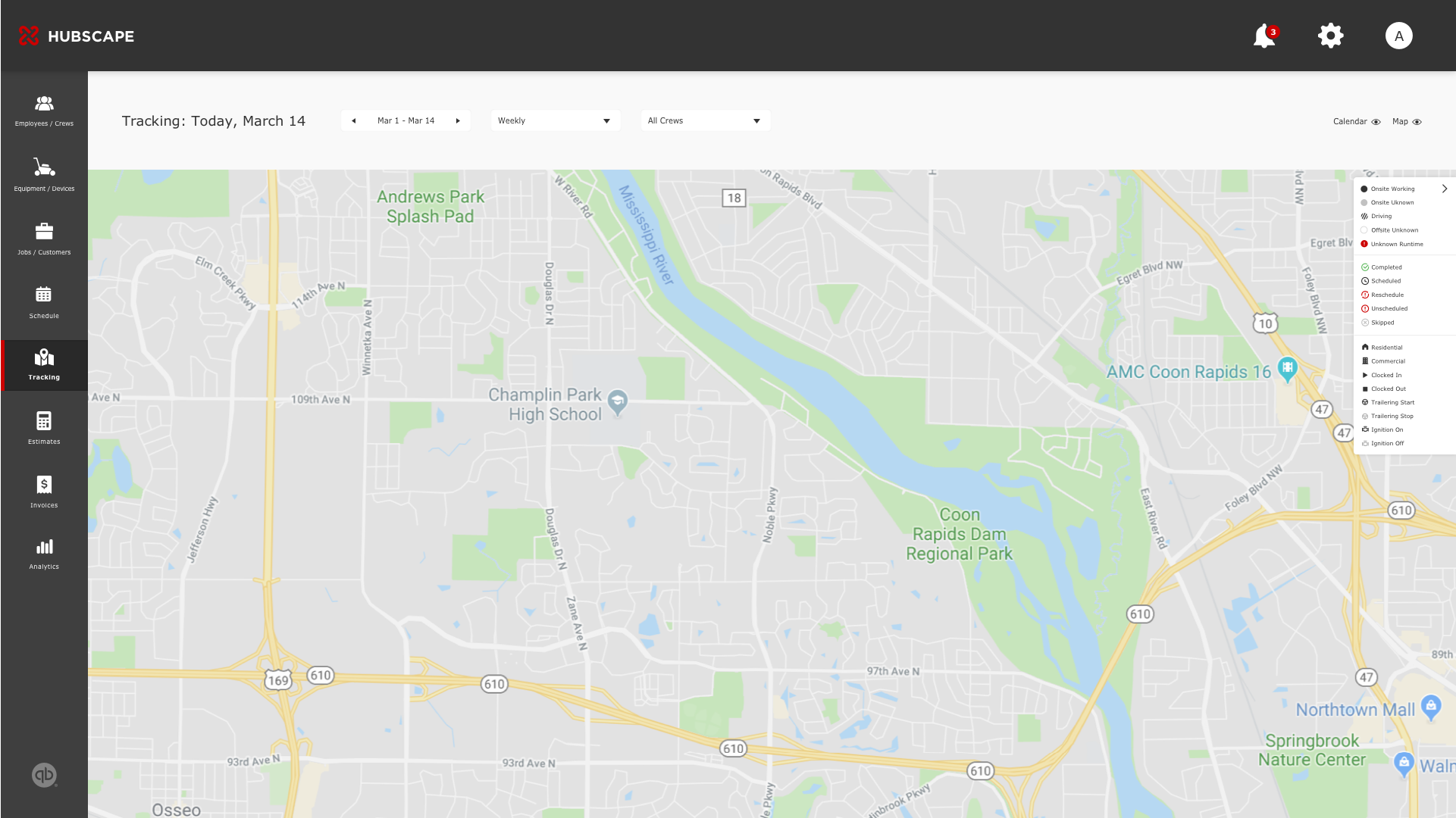
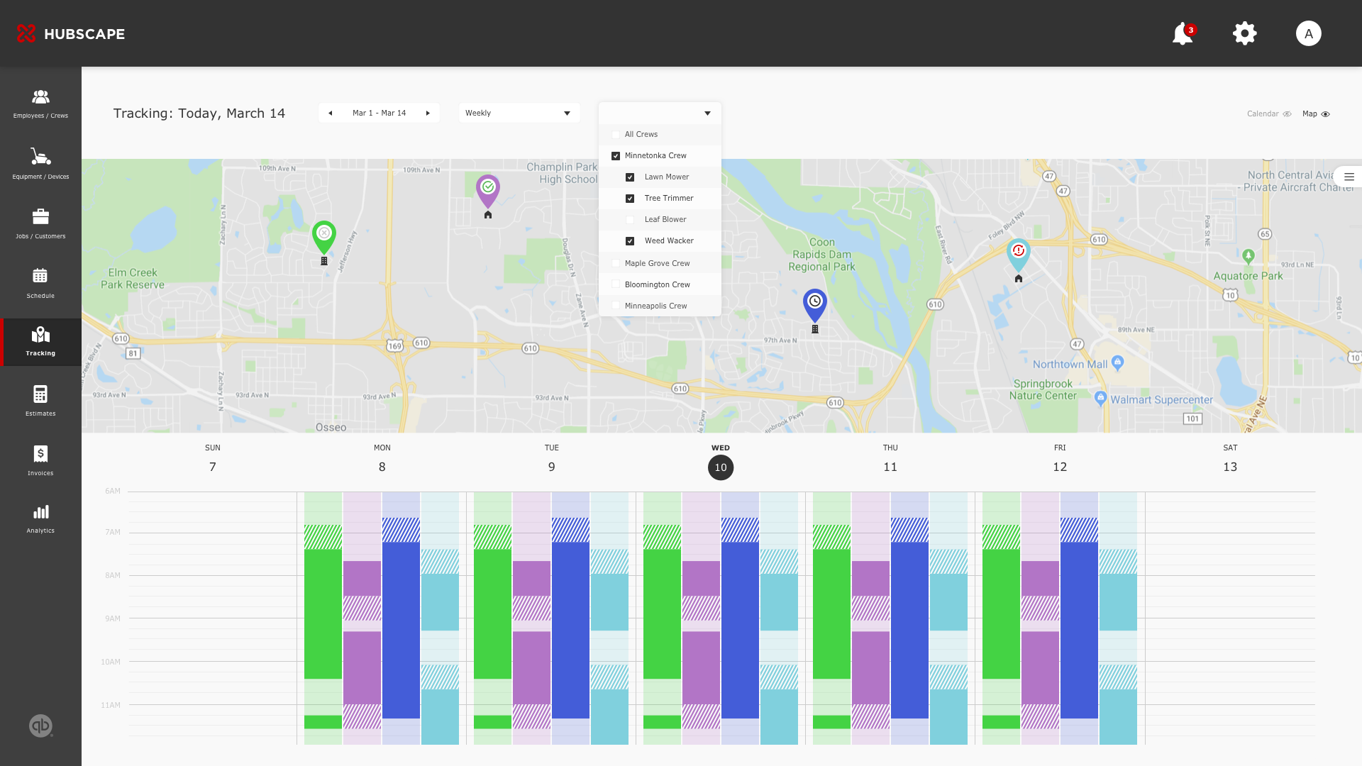
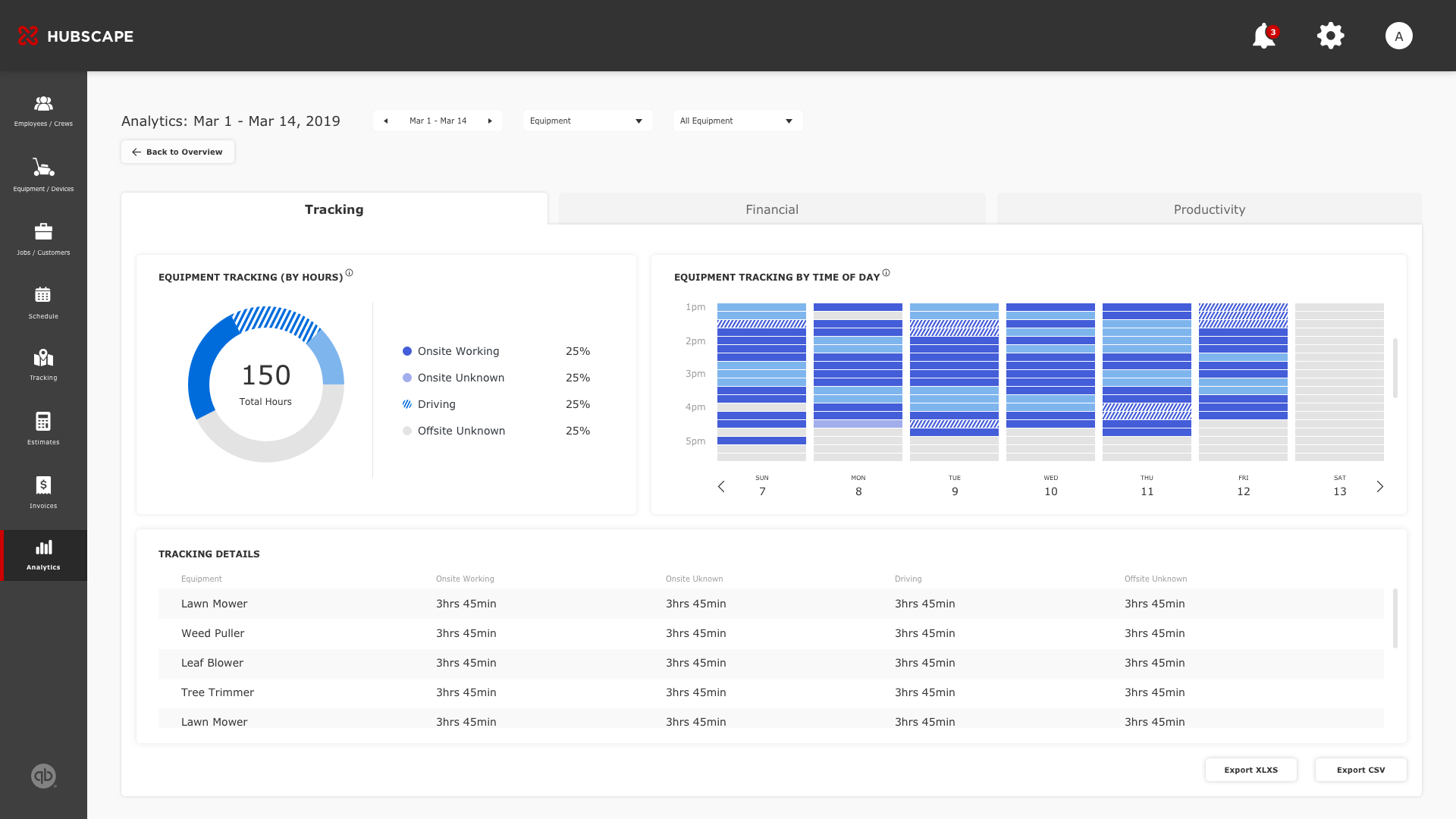
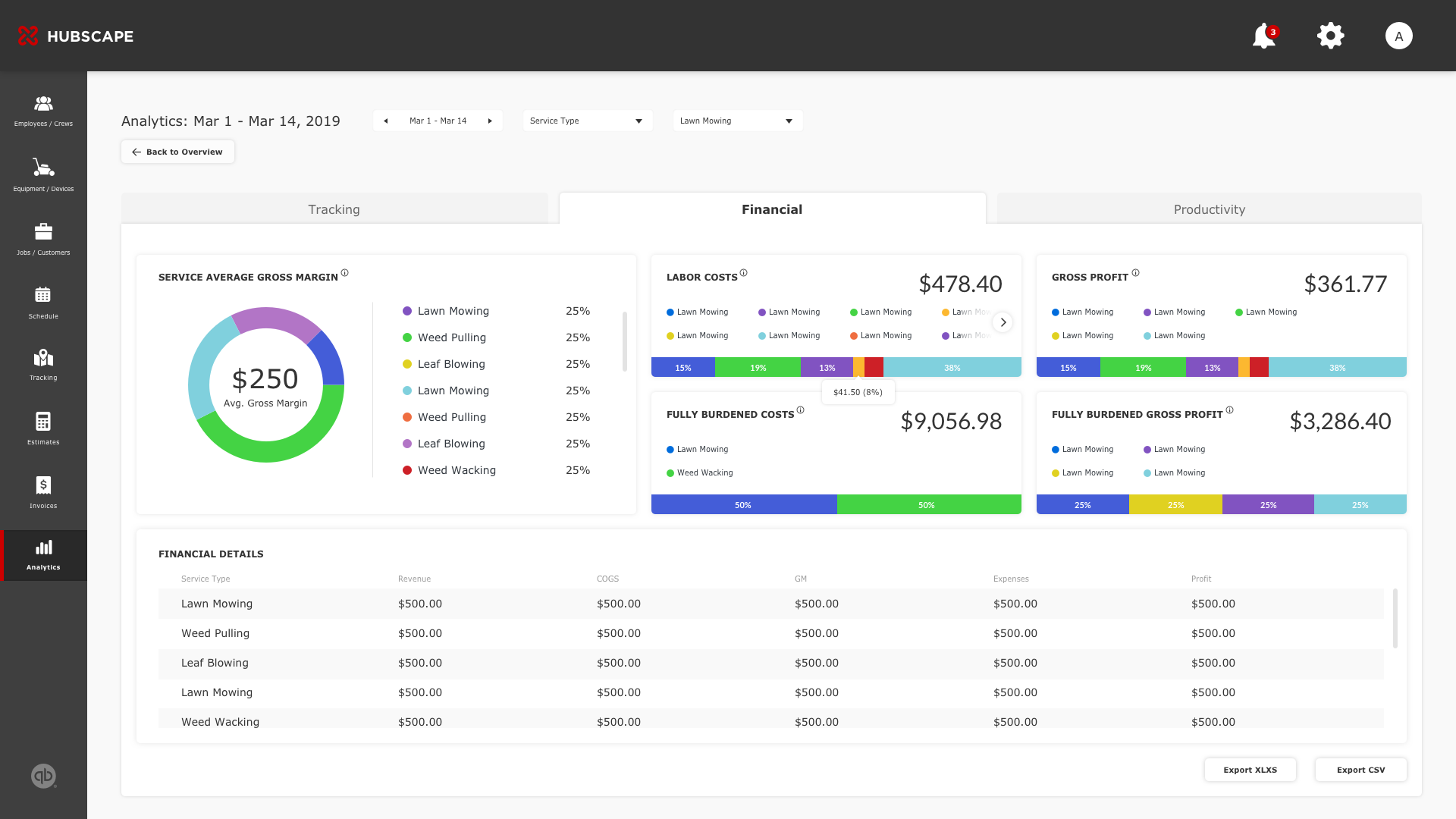
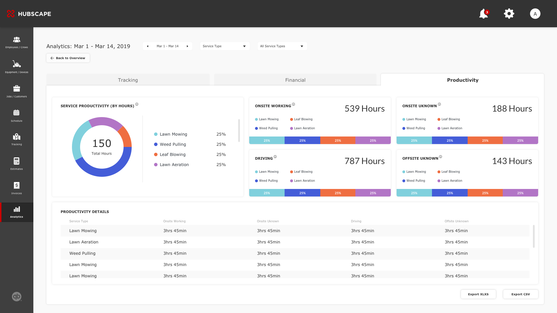
A major goal Hubscape seeks to achieve is to help businesses deliver every landscaping project on schedule and within budget. This starts by setting production objectives from the start, and then monitoring progress as it's documented in the field. There are a few components involved in the tracking system: equipment trailering time, crew traveling time, and onsite start/finish time. To achieve these requirements and at the same time, making it intuitive for operators, I explored data visualizations.
REPORTING: PRODUCTION INSIGHTS
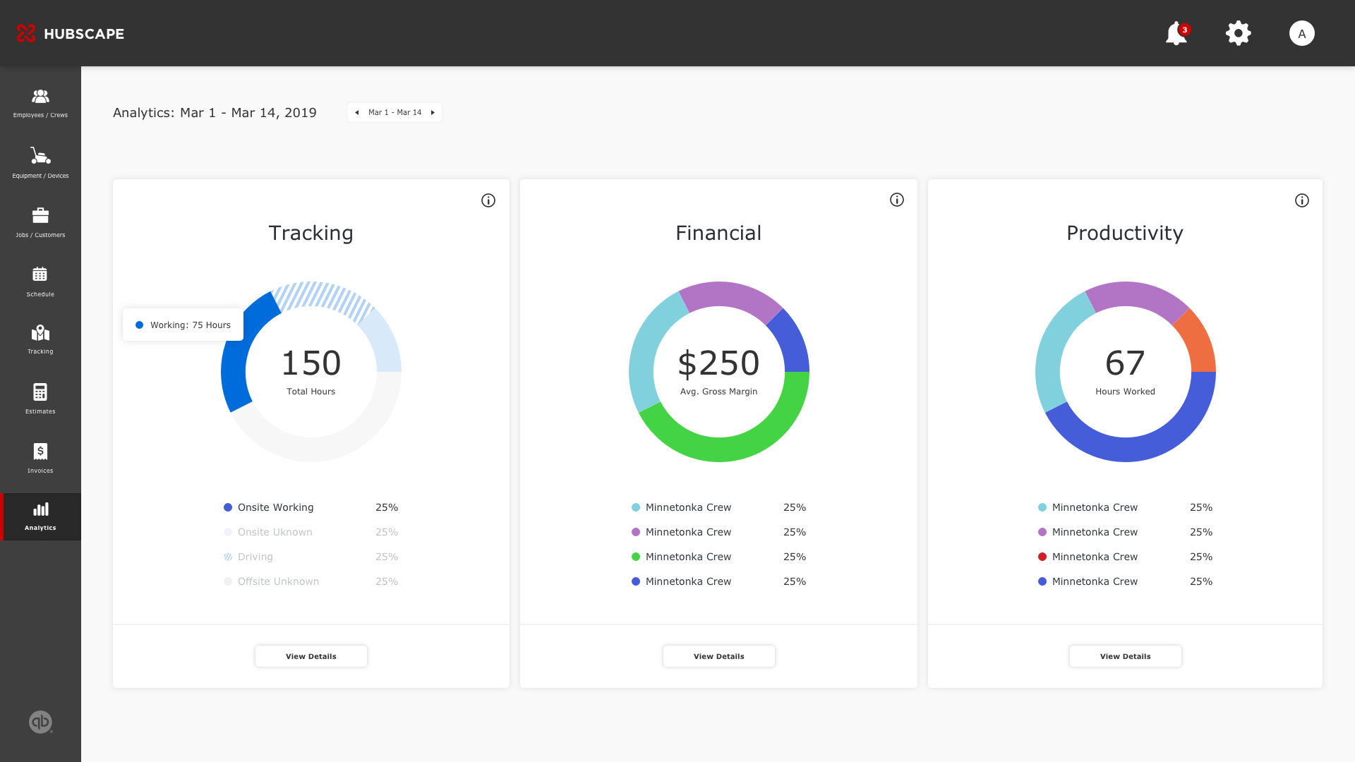
As mentioned in tracking, obtaining production insights is the bread and butter for Hubscape's businesses which brings together all of the functions I've mentioned above. From a high-level overview, the reporting section automatically calculates how efficient you are in each cost code as well as projected time-to-completion to boost your profitability. With that said, my experience with this particular section involved many whiteboard sessions to understand the relationship of each data point and how they can be visually interpreted. The first step was understanding the first line of sight for end users. And then how they drill into the details. To summarize, what's the underlying question a user might ask when then go to the Reporting screen?
Things I've learned from Hubscape:
1. To prioritize end-users over features
-
- For an enterprise product powered by both end-users and internal stakeholders, feature scope becomes a dominant force that may be influenced by everyone touching this product--design, development, and especially, stakeholder decisions. I learned this balance, while being grounded by our power users’ needs.
2. Data is not sexy. Period.
-
- It’s easy to look at a lot of the best visualization projects and want your data to look and feel the same way. I've been asked, "I have such and such data. Is there a visualization technique that I can use to make it look cooler?” I've learned to focus primarily on how visualization can achieve goals such as seeing trends and patterns more easily. Defining how to communicate the relationship between data and images allowed me to determine the most efficient layout for visual components before considering a specific pie chart over a graph because it was sexier.
3. Enterprise UX is complex, but rewarding
-
-
The challenges introduced in this project are, without doubt, overwhelming. But on a user experience perspective, when complexity is being broken down to feel less cumbersome and more like the apps you use on a daily basis, I've reminded the reason why I love what I do.
-


